
Smart Lock Management
Redesign
Client
1aim GmbH
Project Type
Web & Mobile
Product Design
UX Research
Redesign of the mobile and desktop smart lock interface for using and managing digital keys for 1aim GmbH. The project was a complete redesign of the outdated, and quite frankly, unusable system. The redesign involved extensive research with persona, flow, and journey development, followed by wireframes, prototyping, multiple rounds of usability testing with iterative UI implementation.
Overview
Research
Competitor Analysis
We took a look at many different competitors in the "smart lock/access management" sector including August, Danalock, Latch, Yale, etc. to get a feel for what was going on in the field, what others were doing right, and what they were doing wrong. I wanted to avoid those pitfalls and make the best product for our users. With the exception of Latch and August, we saw a lot of ugly things. With my background on the more visual/artistic side of things, coming from Graphic Design, visuals weigh a lot for me; I knew we could make something easy and enjoyable to use, but that could really stand out in comparison with the old traditional German market.
 |
|---|
 |  |
|---|
Wireframing
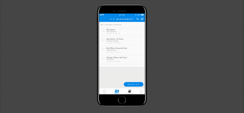
One of the main functions of the smart lock system is creating and sending a digital key, called a "LightPass" to users. In the current app, the screen for this function is one very long scrollable screen, with many fields (who is receiving the LightPass, what door does it give access too and when do they have access, just to name a few.) It felt cluttered, ugly and overwhelming. We knew for the redesign, these were going to be crucial screens to make the app a pleasant experience for our users. We decided early on to use chunking to help break this process down, as the Nielsen Norman Group puts it "break(ing) ... content into smaller chunks to help users process, understand, and remember it better" To avoid information overload, a common mobile problem without the luxurious real esate that we have on web, we needed to break this process down into individual and straight forward steps. We also decided to adapt this wizard-like process to the sign-up steps as well. If users went through this process once for a more common action like signing up, it wouldn't be so overwhelming when it came to the new process of sending a digital key. We also knew we would need a clear progress bar so that users didn't get discouraged or wonder how long the process would take. See first draft wireframes for log in and sign up screens below.
DeCisions
Navigation
Again, with the small real estate of mobile, we needed to ask ourselves, "What’s Important Enough to Be Visible?" We sifted through lots of research on thumb zones and phone handling studies, and also educated ourselves on best practices, such as the recent discovery of the pitfalls of the hamburger menu. Hidden navigation is less discoverable than visible elements. We needed users to quickly access and engage with the key functions of the app, we so opted for a tab bar bottom naviation.
 |
|---|
 |
 |
|---|
UI DESIGN
See below an interaction clip of the step by step process with a clear progress bar for installing a product.
Challenges
Platoform Parity
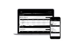
Another challenge here was that the mobile and desktop versions had different core functionalities. Mobile was mainly for using the digital keys that we called "LightPasses" to physically open the doors. By holding your phone up to our mounted hardware, kind of like a scanner, the door would open if your LightPass was valid. The desktop platform was more for a facility manager to create and send these LightPasses to employees, residents, service workers, to name a few examples.
 Old LightCommand and Light Pass designs |  User Personas and Journey Maps |  User Stories for LightCommand |
|---|---|---|
 User Interface |  Multiple screens from LightCommand. |  LightCommand user interface atoms and elements, including popups, fields, buttons, etc. |
 Usability Testing Event |