
Insurance Dashboard
Redesign
Client
Personal Project for WeFox
Project Type
Tablet
UX Research
UI Design
Timeline
5 working days
Overview
This concept was a side project including researching, conceptualizing and redesigning an Insurance Broker Dashboard for a tablet device. The end goal here was a platform for brokers to have their most important things centralized and easy to access, including calendar appointments, tasks, financials, etc.
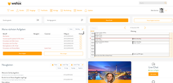 Old WeFox dashboard |
|---|
research
Discovery Phase
I started the discovery phase by briskly educating myself on the topic as hand, what exactly is an Insurance Broker and what can I learn about the end user of this product to help me design it for them? Using an amazing tool, called the internet, I discovered a few important facts about German Insurance Brokers that gave me some insights:
-
A broker represents the insurance buyer, not the insurance company / “Seine Loyalität besteht in erster Linie dem Kunden bzw. Mandanten gegenüber.”
-
Brokers usually work on a commission basis
-
The Proof of Expertise (Nachweis der Sachkunde) to be an officiated Broker includes a very robust list of required credentials.
The first two points lead me a concise conclusion, being a broker means putting your customer first if you want to be successful and make your commission. The third point, the extensive education requirements, lead me to believe that the user will most likely be highly educated, with younger brokers being very fluent in regards to technology, and older brokers being intelligent and quick learners if they are not already used to apps and similar programs.
User Research
I then started to develop user personas to help me to understand my users’ needs, experiences, behaviours and goals. Because of the ramifications of the 5 working day timeline and my lack of qualitative and quantitative data about insurance brokers in Germany, I chose to create Fictional Personas; I did my best to hypothesize and make certain assumptions to create two personas who could be using this dashboard. This step allowed me to step away from my personal perspective and really ask myself: what would Petra Müller and Rory Kullmann need in a dashboard to be their best Broker for their customers? Adding small details such as photos, age group, family status, etc. really helped me to visualize and empathize with my personas. Next I moved on to journey maps for both of my personas to continue focusing on the thoughts, actions and emotions of the user while also illuminating potential pain points and areas of friction.
 User Personas and Journey Maps as part of the UX research stage for the WeFox dashboard concept. |
|---|
Wireframing
Initial Decisions
Now that I had a better understanding of who my user was, and keeping the pain points from my journey map in mind, it was time to make some visual and structural decisions. I recently worked on a similar platform that included complex navigation and an analytics dashboard; for that project we chose to utilize a left panel navigation system that was also collapsible to make the best use of our digital real esate. While the task suggested to “dramatically change the main navigation and challenge the dashboard concept in general” I had to be realistic with my timeline, and understand that every UX challenge does not have to reinvent the wheel. With these factors in mind, and considering that research says left navigation is faster and more efficient for users to scan, I chose to stick with a left navigation panel for this dashboard.
The Redesign
While taking a look at the current design, I noticed that it was scrollable. Thinking about a dashboard, and its purposes here, we want the users to see everything they need in one easy-to-digest overview. Most information dashboards use a three-pronged strategy to establish a sense of control:
-
Giving you a clear understanding of things to help establish a feeling of certainty
-
Giving you the resources to predict and plan for the future
-
Helping you complete critical tasks in time to avoid last-minute panic
A scrollable dashboard did not aid, but impaired, these three focuses. Moreover, adults can only store between 5 and 9 items in their short-term memory and these fade from your brain in about 20 seconds. That doesn’t leave any time for scrolling and gathering even more data, instead the most important things should be present on the dashboard, with the ability to dive deeper into different elements if the user decides they have time.
Hidden Opportunities
While looking through the WeFox website, I noticed the magazine/blog section and thought the dashboard could also show recently posted articles. This could be a great marketing opportunity to boost blog attendance while also aiding users in staying up to date with insurance trends and best practices.
Next, I dove in to some wireframes for the dashboard, and being realistic about my timeline, I skipped handsketching and went right into digital wireframes on Sketch.
 Initial wireframes for the WeFox Dashboard broker portal. |
|---|
Dashboard Design
Staying Consistent
Knowing that WeFox already has other digital products, the website and app, I knew I had a well developed design library that I needed to stay consistent with in the tablet version. After looking on the website for some preexisting screens, I found a few that offered a benchmark to work from. I utilized the current icons for the navigation elements, as well as button styles and the WeFox color scheme. I also took some time to look on sites like Dribbble or UIMovement to see best practices and get ideas for the dashboard layout.
Some of the bigger changes I implemented with the new design include:
-
The navigation now exists in a left side panel, instead of the top bar in the previous design. It is also collapsable to offer more space to focus on the key dashboard modules.
-
The dashboard is no longer scrollable, as previously discussed, and is instead customizable. The user can pick and choose what is important to him and decide what modules are present on his dashboard.
-
Wider spacing for both the calendar, to make scheduling new appointments a more digestible process, and for the Aufgabe module, the previous view felt crammed and could increase stress.
 A selection of imagery used as Dashboard inspiration. |  WeFox Dashboard Screen Designs with notification drop down and hover effect. |  WeFox Dashboard Screen Designs with hover tool tips. |
|---|
Reflections
I think the expedited timeline here was my biggest challenge. With 5 days (including a full time job and fitting in some fun social activities occasionally) it was a struggle to balance the different stages of my design process. Looking back, I feel that I spent a bit too long on the discovery phase and on persona development. That ended up reducing my time for the actual screen designs, and coming from a graphic design background, that is often where I find the most joy. However, I do stand by the time and effort spent on developing my personas as that is an essential part of building a strong foundation for any product. Designing off the feature list or primarily for stakeholders will never product as successful a result as a user centered process.
Another challenge I faced was limiting myself to just a dashboard. As I designed the dashboard, I could really visualize the flow and how my modules could link to other screens for users to dive deeper. The information architecture was also a bit hard for me to understand as I did not have a strong grasp of the big picture - what did the other navigation elements offer and how could they connect with the dashboard? Not having data based personas was also a setback, I wish I had more knowledge on Insurance Brokers in Germany and what their pain points are, with this information the dashboard would have been much stronger and accurate for their needs.
All things considered, I very much enjoyed this design process and would love the opportunity to work on such projects on a deeper level. Any questions regarding my process or designs are welcome, please reach out!